When tasked with creating an A4 brochure for AVE, one of the largest municipal waste management companies in the Czech Republic, I embraced this challenge with enthusiasm and creativity.
Unleashing the Power of Color:
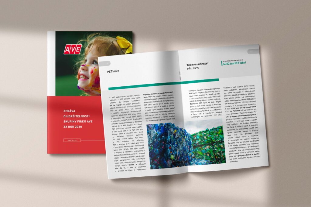
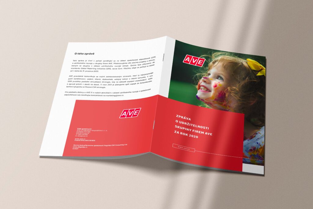
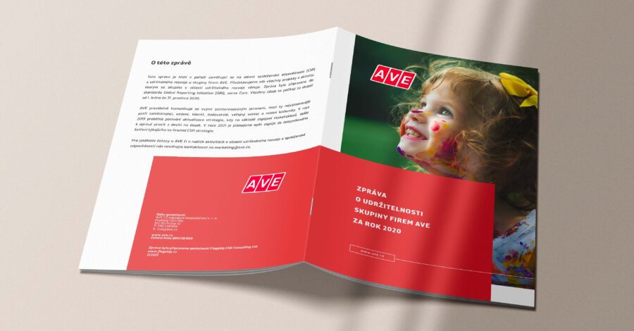
The first step in the design process was to delve into AVE’s brand identity. The AVE logo provided a foundation of classic red and white. As a complementary color I chose a washed green. These colors symbolize trustworthiness and environmental responsibility, values deeply embedded in AVE’s mission.
To harmonize with the existing logo, I meticulously selected additional colors that would resonate with AVE’s core message. Earthy tones, reminiscent of nature’s beauty, were included to accentuate the brochure’s visual appeal and underscore AVE’s commitment to sustainability.

Utilising the Visual Spectrum:
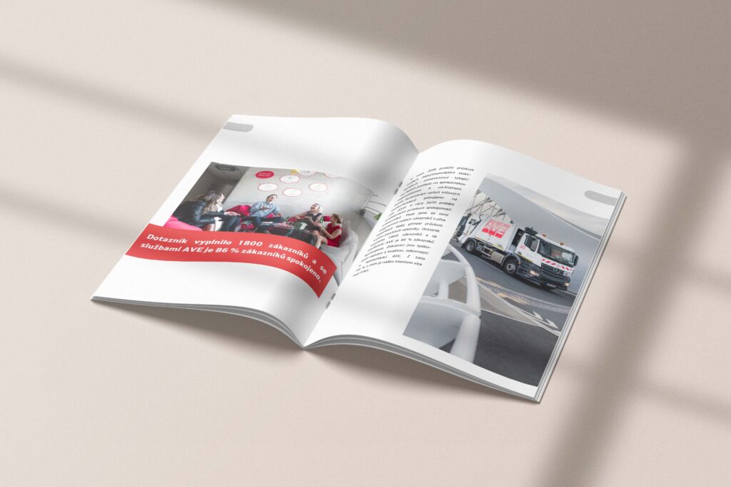
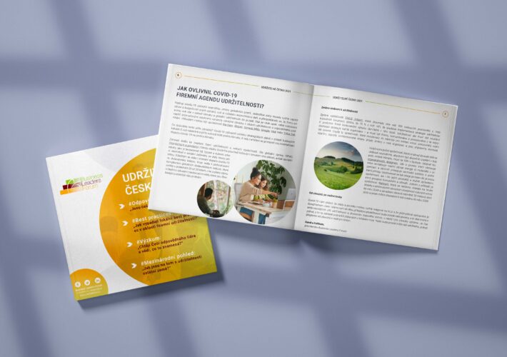
An essential aspect of designing the brochure was the integration of captivating visuals. AVE’s operations span across waste management, recycling, and environmental services, and I wanted to encapsulate the diversity of their work in each page.
Carefully curated photographs, showcasing AVE’s state-of-the-art facilities and dedicated team, breathed life into the brochure. These images not only highlighted the company’s extensive infrastructure but also conveyed the human element behind AVE’s operations, reinforcing the notion that sustainability is a collective endeavor.
From Concept to Printing Press:
After design refinement, the brochure was ready to meet the printing press. The attention to detail in every aspect of the project aimed to produce a final product that would prove to AVE’s reputation as a leader in municipal waste management.
Leave a Comment